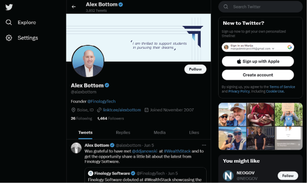
Finology
finology.techClient: Finology LLC
Project Type: Branding & Marketing Solutions
Engagement Model: Technology partner
Location: Idaho, USA
Services: Consulting, Idea Development, Project Management, UX & UI Design, Web Development, Quality Assurance, Maintenance

Finology is an innovative financial firm focused on transforming how people approach and manage their loans.
Challenge:
Finology aimed to reshape its market presence and enhance its service delivery. They required a product firm that handles marketing, design, and development comprehensively.
Our Solution:
Consulting & Marketing Strategy: We provided strategic guidance, helping Finology optimize its marketing approach for better market visibility and engagement.
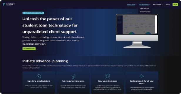
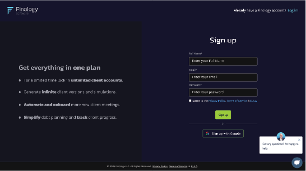
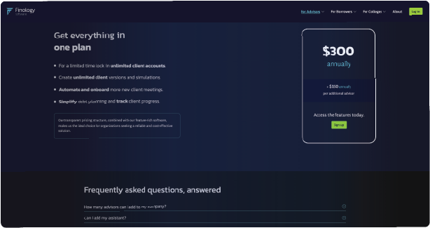
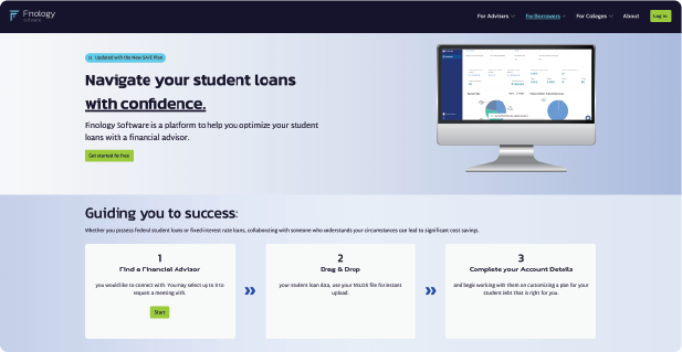
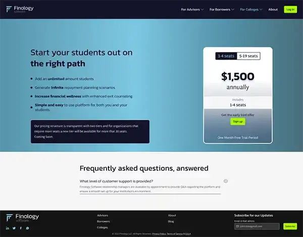
UX & UI Design: We designed an intuitive and engaging website, balancing aesthetics and functionality for an optimal user experience.
Web Development: We created a robust, scalable marketing website to support Finology's enhanced service delivery.
The successful partnership has resulted in a powerful and user-friendly platform, significantly improving Finology's market presence and service delivery to its clients.
Testimonials:
Working with the team at Taraba has been like they are already part of our company. They have a talented team that helped us accomplish our diverse goals and needs... and on time. We are grateful to Taraba for helping us launch our solution and can recommend them for any custom design work.

Alex Bottom,
Founder & CEO @ Finology
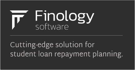
Finology branding
Logo concept
Finology aimed to reshape its market presence and enhance its service delivery. They required a product firm that handles marketing, design, and development comprehensively. Finology aimed to reshape its market presence and enhance its service delivery. They required a product firm that handles marketing, design, and development comprehensively.

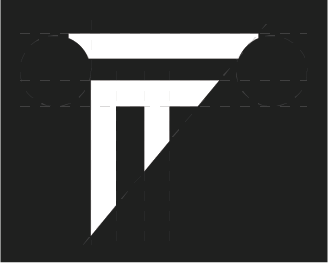
Finology logo evolution
1. A rough combination. The upper horizontal line of the letter F is reshaped.
2. One vertical line was added to cut through the lower one. The first steps were made in the spirit of the antique pillar.
3. Small oval indentations on both vertical lines of the letter.
4. Indentations fixed. Spacing fixed.

Typography:
For logo and headings
Kanit
For body text and anotation
Martel Sans
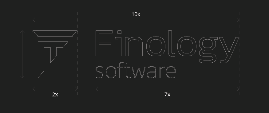
Clear space
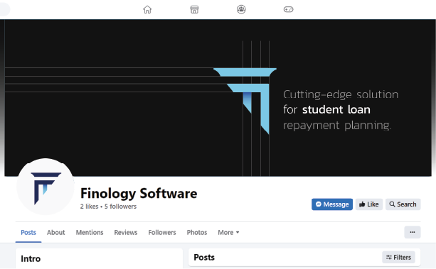
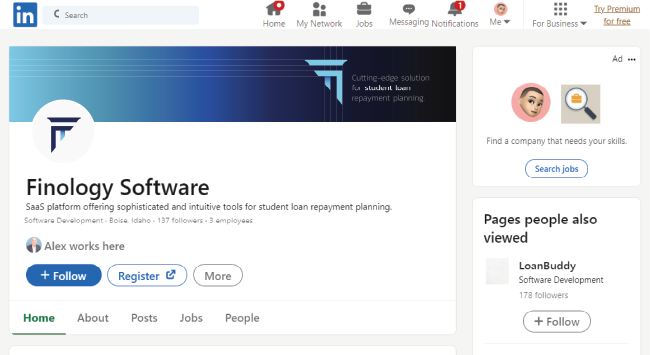
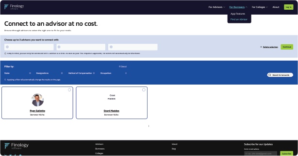
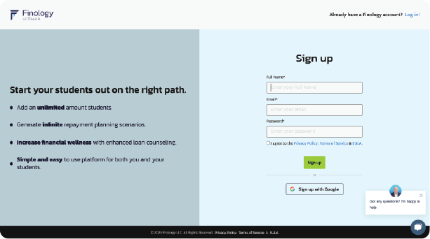
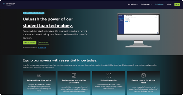
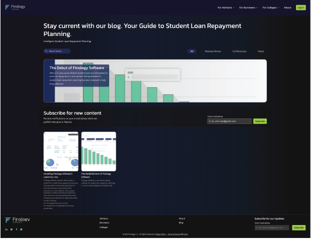
Finology on the web

Color Palette:
Chromatic palette
fin-dark-blue
#14142a
fin-mid-blue
#242958
fin-royal-blue
#2a4b9b
fin-light-blue
#7ec8e3
fin-cta
#a8f800
Achromatic palette
fin-black
#141414
fin-gray
#8E8E8E
fin-white
#F6F6F6




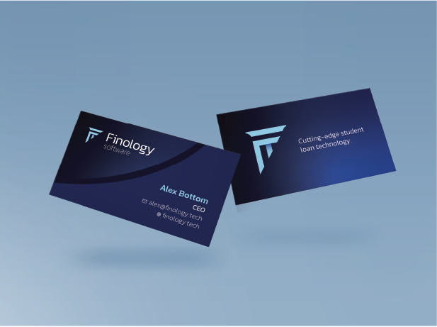
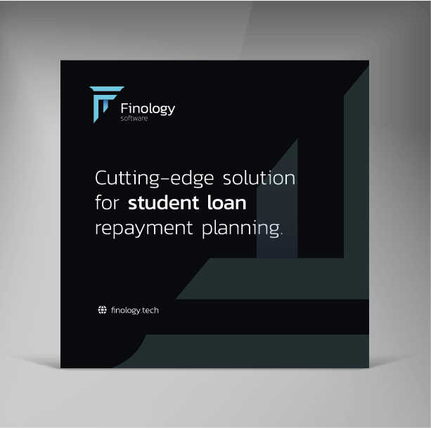
Print material:
